Ever wondered how to add a touch of sophistication and personality to your walls? Two tone wall ideas have surged in popularity because they effortlessly create visual interest, depth, and a modern vibe in any room. Whether you’re aiming for bold contrasts or subtle blends, this technique offers endless creative possibilities to elevate your interior design.
In this article, you’ll find a variety of inspiring two tone wall ideas that cater to different styles and spaces. From playful accents to elegant combinations, these ideas will help you transform your walls into stunning focal points that reflect your unique taste and make your home truly stand out.
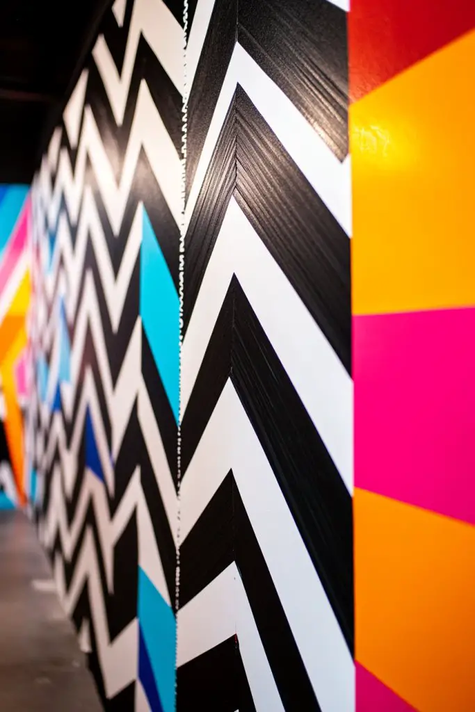
1. Bold Geometric Accents with Sharp Color Contrasts
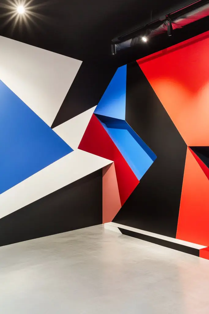
Ever looked at a plain wall and wondered how to make it pop without going overboard? Bold geometric accents are the answer to transforming dull spaces into eye-catching focal points. Many people crave that modern, edgy vibe but feel stuck on how to pull it off stylishly. This idea offers a way to add personality with minimal fuss, making your walls stand out.
Imagine crisp, clean lines forming triangles, squares, or abstract shapes painted in contrasting colors like black and white or navy and gold. The sharp edges create a sense of movement and energy, giving the room a contemporary feel. You might see a wall with a jagged pattern that looks almost like a piece of modern art. The textures are flat but visually striking, catching the light differently depending on the angle.
This technique works well with bold color combos or more subdued palettes like pastel and charcoal for a softer look. You can customize the pattern size—large geometric shapes for a statement wall or smaller ones for subtle interest. In smaller spaces, keep the design minimal to avoid overwhelming the room. Seasons may influence color choices: bright hues in summer, deeper shades in winter.
Start by planning your geometric layout with painter’s tape, measuring carefully to ensure sharp lines. Choose two high-contrast colors—test them on paper first to see how they interact. Tape out your design on the wall, making sure to press edges down firmly for clean lines. Use high-quality wall paint or even exterior-grade paint for durability. Remove tape slowly once paint is dry, revealing crisp shapes. For a professional touch, consider using a small foam roller for even coverage.
Add metallic or gloss finishes to certain shapes for a bit of shimmer or depth. Incorporate your favorite colors or themes by adjusting the shape sizes or patterns—think triangles for a futuristic vibe or organic shapes for a more playful look. You can also create a layered effect by overlapping shapes with different tones. Personal touches like initials or symbols can be subtly integrated into the design.
Bold geometric accents instantly elevate a space and showcase your modern style. It’s a versatile approach that fits both minimalist and maximalist tastes. Once you see how clean and striking the lines look, you’ll feel inspired to experiment more. Ready to turn your bland wall into a piece of art?
2. Subtle Ombre Transition for Elegant Sophistication
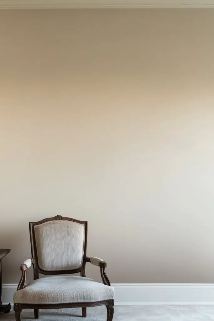
Feeling like your walls lack depth and dimension? An ombre transition offers a soft, sophisticated way to add visual interest without overwhelming the space. This technique appeals to anyone wanting a calm yet elegant backdrop that elevates the room’s ambiance. It’s perfect for creating a subtle focal point that still feels refined.
Picture a gentle gradient shifting from a light cream at the top to a deeper taupe at the bottom. The seamless blend creates a soothing visual flow, almost like a watercolor painting. When sunlight hits it, the colors subtly change, adding warmth and richness. The smooth transition makes the wall feel layered and dynamic, without any harsh lines.
Choose colors that complement your decor—cool tones for a serene vibe or warm hues for cozy comfort. The gradient can be vertical or horizontal, depending on your preference and the room layout. For small rooms, soft pastels work well, while richer shades suit larger, more formal spaces. Seasonal variations might include transitioning to deeper shades in winter for a cozy feel.
Start with high-quality paint in your chosen colors. Use a sponge or a soft brush to blend as you go, working from light to dark. Apply the darker shade at the bottom and gradually lighten as you ascend, blending thoroughly to avoid visible lines. You might need to go over the area multiple times for a perfect fade. Use painter’s tape to keep edges clean if you prefer a defined start and end point. For extra smoothness, a roller with a textured nap can help blend colors more naturally.
Incorporate metallic or pearl-like paints at certain points for a subtle shimmer. Accentuate the ombre with decorative molding or textured finishes nearby. You can also add a faint metallic sheen to the darker hues for a touch of glamour. Personalize with a favorite color palette that resonates with your style or mood, making the space uniquely yours.
A subtle ombre wall transforms a plain backdrop into a piece of understated art. It adds depth without clutter or busy patterns, ideal for modern or minimalist homes. Once you master the blend, you’ll find endless ways to adapt it across rooms and seasons. Feeling inspired to create a tranquil, elegant space?
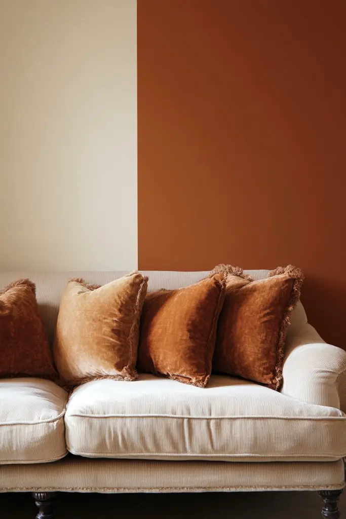
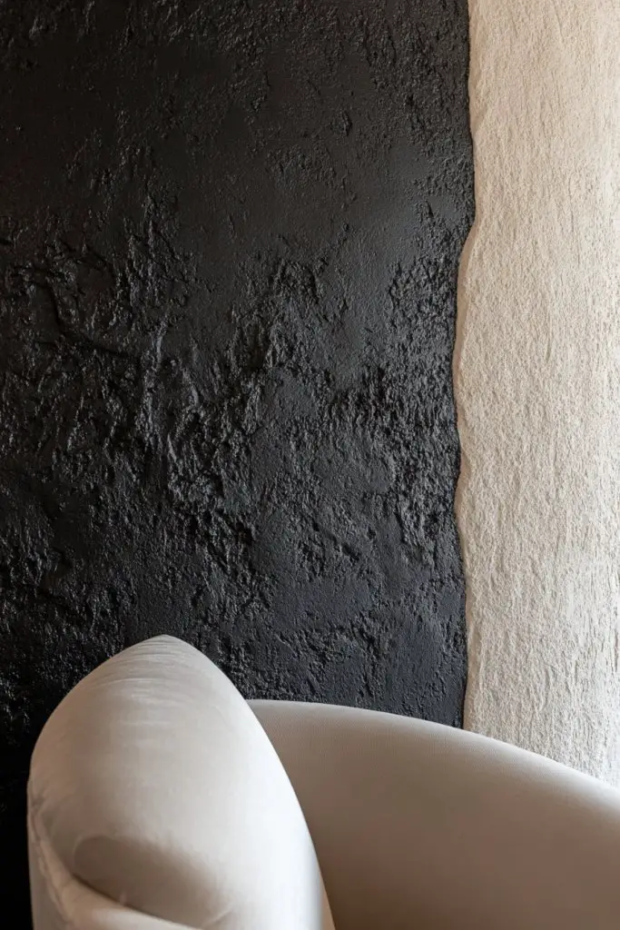
3. Half-Wall Color Blocking for Visual Interest
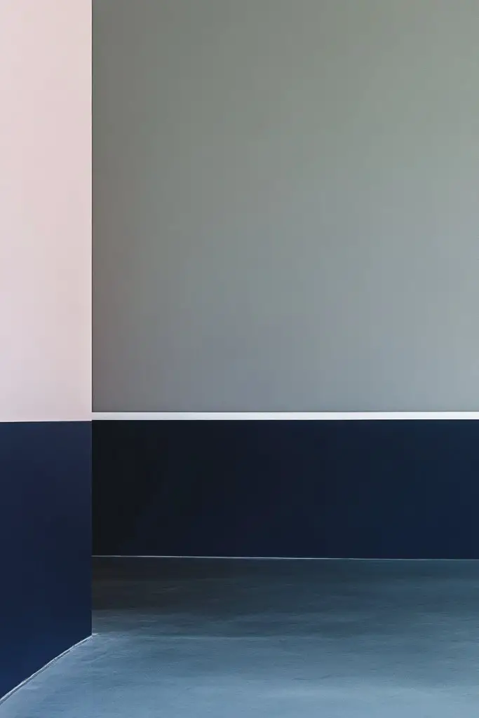
Sometimes, a full wall feels too overwhelming or busy, but you still want to inject some personality. Half-wall color blocking offers a balanced way to define spaces and add a modern twist without overdoing it. It’s a simple trick to make your room look more intentional and stylish with minimal effort. Plus, it’s easy to change whenever you crave a new look.
Imagine a crisp line dividing a soft pastel top from a bold, darker shade on the bottom. The contrast creates a visual anchor that draws the eye and adds structure to the space. The clean division can be aligned with furniture or architectural elements, emphasizing symmetry or asymmetry. It feels fresh and contemporary, breaking the monotony of all-one-color walls.
You can choose to paint the upper or lower half, depending on your focus. For a cozy vibe, darker colors on the bottom paired with lighter tones on top work well. In open-plan areas, color blocking helps define distinct zones like dining or lounge areas. For a seasonal update, swap colors or add textured paint to refresh the look. Different heights of the dividing line can create playful or formal effects.
Start by measuring and marking your dividing line with a level and pencil. Use painter’s tape to create sharp, clean edges—press down firmly to prevent bleeding. Choose contrasting colors that complement your existing decor. Paint the bottom or top section first, let it dry, then tape over it to paint the other half. Remove tape carefully after the paint dries for crisp lines. For durability, finish with a semi-gloss or eggshell topcoat.
Add decorative trim or molding along the dividing line for extra detail. Incorporate different textures like wallpaper or textured paint on one section for contrast. You could also personalize with stenciled patterns or subtle geometric shapes within the blocked area. Decorative shelving or ledges placed along the line can add functional space while accentuating the design.
Half-wall color blocking instantly updates a space and makes an ordinary wall look thoughtfully designed. It’s a versatile, budget-friendly idea that suits any room style. Once you see how clean and impactful the contrast is, you’ll be encouraged to experiment more. Ready to redefine your walls?
4. Vertical Two-Tone Stripes for Taller Appearance
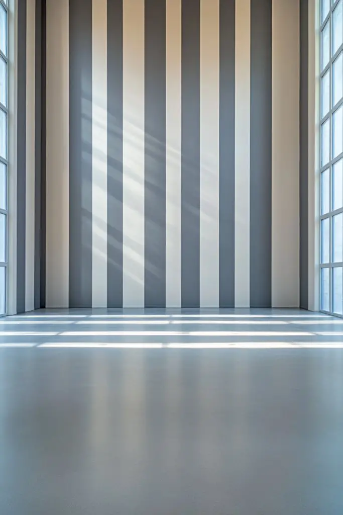
Ever feel like your ceilings are too low or your walls look squished? Vertical stripes can create the illusion of height, making your space feel more open and airy. It’s a simple trick that instantly transforms the room’s proportions without any structural work. Plus, it’s a fun way to add a lively pattern to your decor.
Picture bold, evenly spaced stripes stretching from floor to ceiling in contrasting colors like navy and white or warm beige and chocolate. The vertical lines guide your eye upward, giving the room a sense of grandeur. The pattern adds rhythm and movement, making even a modest space feel more expansive. The stripes can be matte or gloss, depending on the ambiance you want.
Opt for wide or narrow stripes based on your preference—wider for a bold statement, narrower for subtle sophistication. For a more playful look, alternate colors or add metallic accents. In small rooms, keep the stripes thin to avoid overwhelming the space. Seasonal tweaks can include changing stripe colors or adding decorative molding between stripes for extra texture.
Start by marking out your stripes with a level and painter’s tape, ensuring even spacing. Use a ruler or a straight edge for precision. Paint one stripe at a time, allowing each to dry before removing tape. For sharp edges, press tape down firmly and use a small brush to touch up any uneven lines. Consider using a high-quality semi-gloss or satin finish for a polished look. Repeat with the second color, ensuring a clean separation.
Incorporate metallic or iridescent paints for a shimmering effect. You can also add texture by using a brush or sponge to create subtle variations within the stripes. Personalize by painting stripes in your favorite color combinations or varying stripe widths for a more eclectic vibe. Adding a coordinating border or crown molding enhances the overall effect.
Vertical stripes are a timeless way to add height and style to any room. They’re straightforward to implement and customizable to fit your personality. Once finished, you’ll notice how much more spacious and elegant your room feels. Ready to stretch your walls into a new dimension?
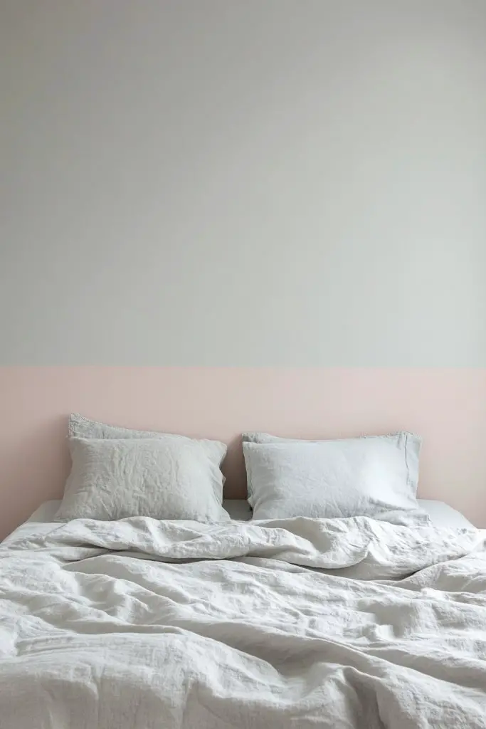
5. Horizontal Color Blocking for Cozy Vibe
Feeling like your room is missing warmth and intimacy? Horizontal color blocking can create a cozy, inviting atmosphere that makes a space feel more layered and finished. It’s an easy way to add depth and interest without cluttering the walls with accessories. Perfect for bedrooms or living rooms that need a soft, welcoming touch.
Imagine a wall divided into two horizontal bands—perhaps a soft blush at the top and a rich terracotta at the bottom. The contrasting bands add a tactile feel, like a layered fabric or a painted mural. The broad stripes guide your eye across the space, creating a sense of comfort and enclosure. The finish can be matte to enhance the cozy vibe or satin for a touch of subtle sheen.
Vary the width of the bands based on your ceiling height—wider for taller walls, narrower for smaller spaces. Use warm, earthy tones for a rustic feel or cool shades for a modern look. You can also incorporate textured paints or subtle patterns within the bands for added richness. Seasonal updates can include swapping out colors or adding decorative borders.
Begin by marking your horizontal lines with a level and painter’s tape at your desired height. Paint the top section first, then carefully tape along the boundary before painting the bottom. Use quality brushes or rollers for smooth application. For sharper lines, press tape down firmly and remove it after the paint has dried completely. Finish with a protective topcoat if needed. You might need multiple coats for solid, vibrant colors.
Add decorative trims or textured finishes within the bands for extra visual interest. Incorporate subtle patterns or stenciled designs along the edge of the bands for a personalized touch. You could also use wallpaper or textured wallcoverings in the bands for a layered effect. Personalize with your favorite shades or combine with artwork placed strategically on the neutral sections.
Horizontal color blocking instantly adds warmth and character to any room. It’s a straightforward project that yields dramatic results. Once you see how cozy and complete your space feels, you’ll be inspired to try other creative wall treatments. Ready to make your walls feel like a warm hug?
6. Textured Two Tone with Matte and Satin Finishes
Do your walls look flat and uninspired no matter how many art pieces you hang? Textured two-tone finishes bring tactile richness and visual depth that make a wall come alive. This method adds an element of surprise, elevating your decor beyond basic paint. It’s perfect for those who crave a sophisticated, layered look.
Imagine a wall where one half has a smooth matte finish in a muted color, while the other features a subtle satin sheen with textured patterns like sponging or rag-rolling. The contrast between matte and satin creates a play of light and shadow, giving the surface a dimensional quality. These textures can be as subtle or as bold as you like, from silky smooth to heavily textured.
Mix finishes within the same color palette or choose contrasting hues for extra impact. Use textured techniques like stippling, stippling, or combing to create patterns and movement. For a more refined look, focus on one feature wall with a textured finish, keeping the rest simple. Seasonal tweaks include adding metallic or iridescent accents to amplify the effect.
Apply primer if needed for uneven surfaces. Use specialized textured paints or techniques like sponge, brush, or rag for application. For sharp distinctions between matte and satin, tape off sections carefully before painting. Layer multiple coats if necessary, allowing each to dry thoroughly. For best results, use high-quality brushes and rollers designed for textured finishes. Finish with a clear protective sealant if durability is a concern.
Incorporate metallic or pearl accents within the textured areas for a touch of glamour. Use stencils or hand-painted patterns to add artistic flair. Experiment with different textures and finishes in various sections to create a dynamic, multi-dimensional wall. Personalize by selecting colors and textures that reflect your style and mood.
Textured two-tone walls add a luxe, gallery-like feel to your home. They’re a great way to showcase artistic flair without needing actual artwork. Once you master the techniques, you’ll see how versatile and impressive textured finishes can be. Ready to add a tactile layer to your decor?
7. Framed Two Tone Accent Wall with Decorative Molding
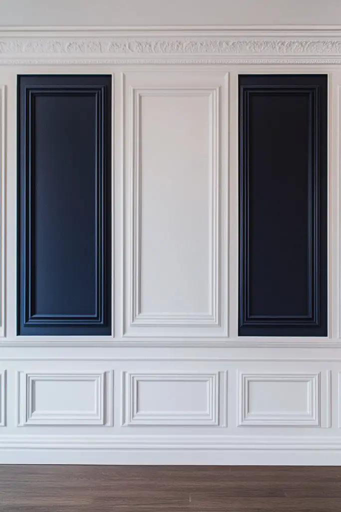
Are your walls feeling plain and uninspired? Framed sections with decorative molding create a refined architectural feature that instantly elevates any room. It adds a sense of craftsmanship and detail without a full renovation. This approach makes your wall look custom, sophisticated, and totally Pinterest-worthy.
Visualize a section of the wall outlined with simple or ornate molding, painted in contrasting shades—perhaps a deep navy framed by a crisp white. The framed panel acts like a piece of art, drawing attention to the space. The molding adds depth, shadow, and a classic touch, reminiscent of gallery walls or traditional paneling. The effect is both timeless and modern, depending on your choice of mold and color.
Use different molding styles—flat, beveled, or ornate—to match your decor. The framed panel can be centered or placed asymmetrically for a contemporary twist. Colors can be bold for drama or soft for subtle elegance. This technique adapts well to bedrooms, living rooms, or even bathrooms where a splash of architectural detail is desired.
Start by measuring and marking the framed area with a level and pencil. Attach decorative molding using nails or adhesive, ensuring it’s flush and level. Prime and paint the molding first if needed, then paint the framed section in your contrasting color. Carefully tape off the borders to keep lines sharp. For a polished finish, caulk any gaps and touch up paint as necessary. Consider sealing the molding for durability.
Add small decorative elements like rosettes or corner blocks for extra detail. Incorporate contrasting textures—matte paint with gloss molding—for visual interest. Personalize by choosing colors that complement your overall scheme or by adding subtle patterns within the framed area. You can also incorporate lighting fixtures like sconces nearby to highlight the feature.
Framed molding transforms a simple wall into a piece of architecture. It’s a subtle luxury that elevates your space and showcases your attention to detail. Once installed, you’ll feel proud of elevating your decor with elegant craftsmanship. Ready to frame your walls with style?
8. Two Tone Wall with Asymmetrical Shapes
Bored of symmetrical, predictable walls? Asymmetrical shapes add a playful, artistic edge that breaks the mold. This style invites curiosity and adds a unique personality to your space. It’s perfect for those who want to make a bold statement without overwhelming the room.
Picture irregular panels, organic blobs, or jagged geometric shapes painted in contrasting hues like coral and teal or charcoal and blush. The asymmetry creates visual tension and interest, drawing the eye across the wall in a dynamic way. These shapes can be large or small, layered or overlapping, giving room for creative freedom. The overall effect is energetic and modern.
Use freeform shapes for a more artistic feel or geometric panels for a structured look. Colors can be bold or muted, depending on your style. The shapes can be placed randomly or in a balanced composition—there’s no right or wrong here. This technique adapts well to eclectic, boho, or contemporary decor. Seasonal updates might include changing shape sizes or colors.
Sketch your shapes on paper first, then transfer the design onto the wall with a pencil. Use painter’s tape for clean edges, especially for geometric forms. Fill in the shapes with contrasting paints, applying multiple coats if needed. Layering shapes can add depth, so overlap some elements slightly. Remove tape carefully once dry. For a cohesive look, stick to a limited color palette.
Incorporate textured paints or metallic accents within the shapes for extra flair. Use different finishes—matte, gloss, or satin—to highlight areas. Personalize with initials, symbols, or motifs within the shapes. Adding small built-in shelves or ledges can enhance functionality while maintaining the artistic vibe.
Asymmetrical shapes turn your walls into a canvas of creativity. They offer endless customization options and a chance to showcase your artistic side. Once you see how lively and fresh the design looks, you’ll be motivated to explore more innovative wall treatments. Ready to embrace the unconventional?
9. Two Tone Wall with Diagonal Divisions for Dynamic Flow
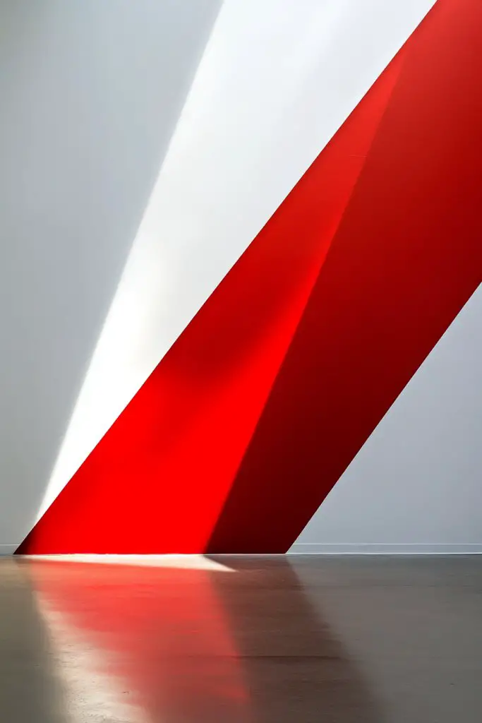
Want to add movement and energy to your space? Diagonal divisions in two-tone walls create a sense of flow that guides the eye across the room. It’s a bold design choice that breaks away from traditional straight lines. This technique injects vibrancy and modernity into any room.
Imagine a wall painted with a sharp diagonal line running from one corner to the opposite side, splitting two contrasting colors like emerald green and soft beige. The angle adds dynamism, making the space feel more alive. When paired with furniture or decor, the diagonal can direct focus and emphasize architectural features. The contrast can be high for drama or subtle for elegance.
Adjust the angle’s steepness for different effects—more acute for a dramatic look, gentler for subtlety. Colors can be bold or muted, and the diagonal line can run from corner to corner or across the middle of the wall. This technique works well with accent walls or entire rooms. Seasonal updates include changing the color scheme or adding textured finishes along the diagonal.
Use a level and painter’s tape to mark the diagonal line precisely. Choose contrasting colors and tape along the line, pressing firmly to prevent bleeding. Paint one side first, then carefully remove the tape after drying. Re-tape along the same line for the second color, ensuring clean separation. Use high-quality brushes or rollers for smooth application. For sharper edges, touch up with a small detail brush.
Add accent trim or metallic tape along the diagonal for extra flair. Play with different color combinations or even add patterns within each section. Incorporate lighting accents like wall washers to highlight the sharp lines. Personal touches like decals or motifs can be placed strategically to complement the diagonal design.
Diagonal divisions bring a fresh, energetic vibe that elevates your decor instantly. They’re easy to customize and adapt to your style, making your walls a statement piece. Once you see how much movement they add, you’ll be inspired to experiment with other bold geometric designs. Ready to create a room full of energy?
10. Two Tone Wall Using Chalkboard and Neutral Shades for Functionality
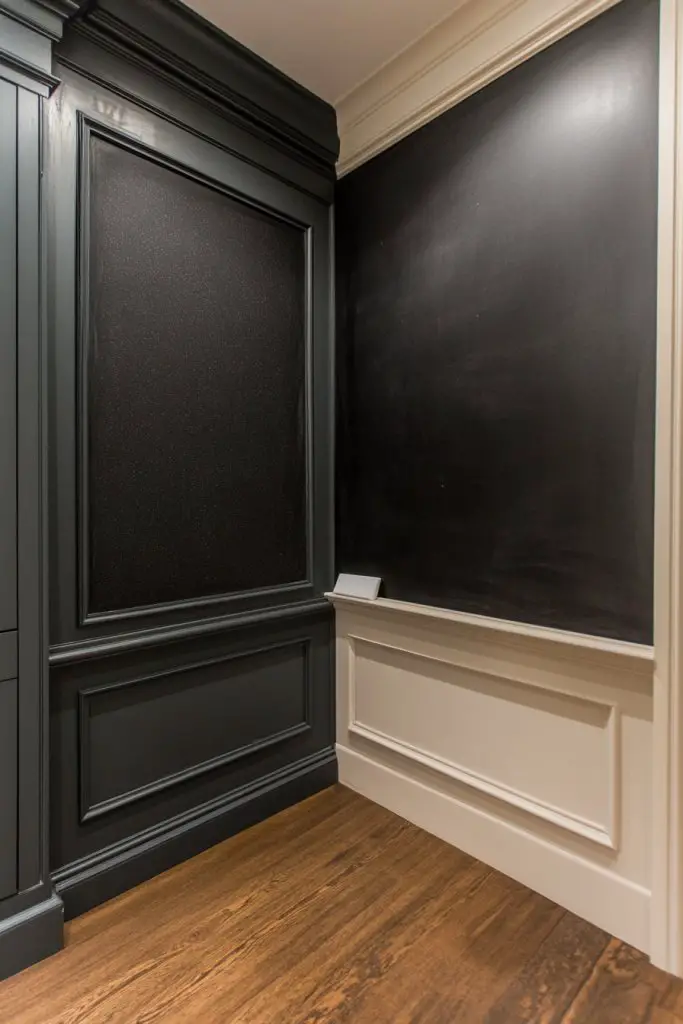
Looking for a practical way to add personality and functionality to your walls? Combining a chalkboard section with neutral shades creates a versatile space for notes, doodles, or motivational quotes. It’s perfect for kitchens, offices, or kids’ rooms. This dual-purpose wall keeps your space lively and useful at the same time.
Picture a large wall where one side is painted in a soft taupe or gray, while a sizable rectangular area is coated with chalkboard paint in matte black or dark green. The contrast between smooth, neutral paint and the textured, writable surface creates visual interest. You can write reminders, menus, or sketches, adding a dynamic element that changes every day. The chalkboard section becomes a focal point, inviting interaction.
Place the chalkboard area strategically—centered or off to one side—depending on your space. You can frame the chalkboard with molding or keep it open for a more casual look. For different seasons or moods, switch chalk colors or add decorative borders. This concept adapts well to small or large walls, and the neutral shades can be customized to match your decor.
Paint the wall with your chosen neutral color first, ensuring an even, smooth finish. Apply painter’s tape around the designated chalkboard area, then coat with a high-quality chalkboard paint. Multiple thin coats work better than one thick layer. Once dry, condition the chalkboard surface with chalk to prevent ghosting. Use a level and tape to keep the edges crisp and neat. Regular cleaning keeps the surface looking fresh.
Add decorative trim or a frame around the chalkboard for a refined look. Incorporate colorful chalks, erasers, or even magnetic accessories to make it more functional. Personalize with inspirational quotes or artwork that can be easily updated. Pair with practical storage solutions nearby for markers or cleaning supplies.
A combined chalkboard and neutral wall is both playful and functional, perfect for families or creative spaces. It encourages communication and organization while adding a touch of personality. Once you see how easily it transforms your wall into a versatile hub, you’ll be motivated to explore more interactive decor ideas. Ready to make your wall a canvas?
11. Two Tone Wall with Striking Accent Section and Neutral Background
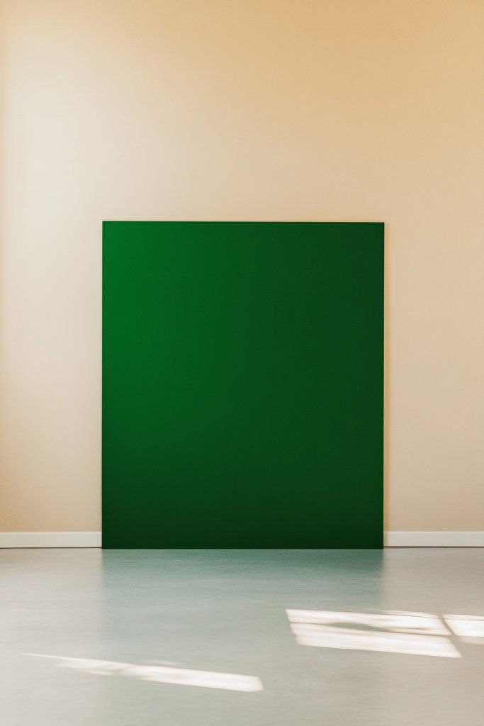
Sometimes, one plain wall just doesn’t cut it anymore, but full-on bold designs feel too overwhelming. A striking accent section paired with a neutral background creates a focal point that’s eye-catching yet balanced. It’s a simple way to add drama and sophistication without cluttering your space. Perfect for making a statement with minimal effort.
Visualize a large wall with a bold, colorful rectangle or abstract shape painted in a vibrant hue like deep red or electric blue. This accent area anchors the room, while the surrounding neutral shades keep the overall look calm and refined. The contrast draws the eye immediately, creating a sense of depth and dimension. This design works well with modern, eclectic, or minimalist decor styles.
The accent section can be geometric, organic, or irregular depending on your style. Colors can be bright or muted—think jewel tones or pastel shades—for different moods. The size of the accent can vary from a small patch to a large section covering most of the wall. Seasonal updates can include changing the accent color or adding patterns within the shape.
Begin by sketching your design on paper, then carefully tape out the shape with painter’s tape. Use a level or straight edge to keep lines precise. Paint the background in a neutral tone first, then fill in the accent section with your chosen bold color. For crisp edges, press tape down firmly and remove after the paint dries. Multiple coats may be necessary for vibrant, even coverage.
Incorporate decorative borders or metallic accents within the shape for added flair. Personalize by including your favorite pattern or motif inside the accent area. You can also add textured finishes or layered paints to enrich the visual depth. Pair with complementary decor elements like cushions or curtains that echo the accent color.
A striking accent section instantly elevates your decor and draws focus to the wall. It’s adaptable to any style and easy to update seasonally or as your taste evolves. Once you see how impactful a simple shape can be, you’ll be motivated to explore other bold, creative wall ideas. Ready to make your wall a focal masterpiece?
12. Two Tone Wall with Subtle Metallic Accents
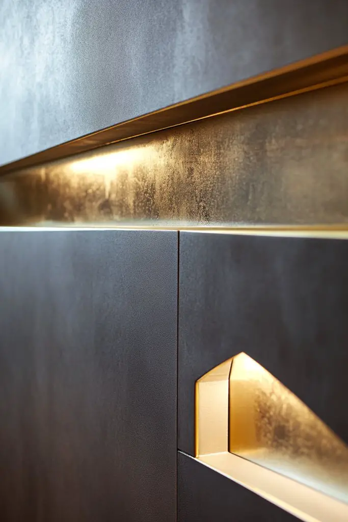
Looking to add a touch of glamour without going over the top? Metallic accents in a two-tone wall can do just that—bringing a sleek, modern edge and a hint of luxury. It’s perfect for elevating everyday spaces with a subtle shimmer that catches the light. This style suits contemporary, industrial, and even classic interiors craving a luxe upgrade.
Imagine a wall painted in a matte, muted tone like soft gray or beige, with strategic metallic accents—perhaps in gold, silver, or bronze—highlighting certain areas or lines. The metallic parts reflect light, creating a dynamic interplay of glow and shadow. The overall effect is understated but undeniably chic, adding depth and sophistication. You might see a geometric pattern or random streaks of metallic paint for a contemporary look.
Use metallic paints as accents within geometric shapes, borders, or streaks for a minimalist yet glamorous effect. Different finishes—matte, satin, or gloss—can be combined to enhance the visual interest. For a softer look, keep the metallic accents subtle; for more drama, go bold with larger patches or stripes. Seasonal updates can include changing the metallic shades or adding additional reflective details.
Apply a base coat of your chosen neutral or matte color first, then carefully tape off areas for metallic application. Use high-quality metallic paint or metallic leafing for the best shine. Apply with a small brush or sponge for precision, avoiding overlaps for a clean look. For textured or streaked effects, use a dry brush or rag to blend metallic paint into the base color. Finish with a clear sealant to preserve the shine.
Incorporate metallic accents into patterns, borders, or even abstract designs tailored to your style. Mix different metallic shades for a layered, multidimensional effect. Personalize further with textured finishes or by adding decorative hardware nearby. The key is balancing shimmer with matte for a refined, elegant appearance.
Subtle metallic accents add a modern, glamorous touch that’s surprisingly versatile. They can be as understated or bold as you like, fitting various decor styles. Once you experience the luminous effect, you’ll be inspired to experiment with more luxe details. Ready to shine?
13. Two Tone Wall with Artistic Brush Strokes for a Hand-Painted Look
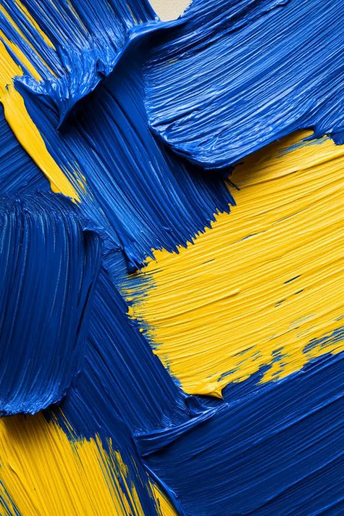
Want your walls to look like a piece of art, full of life and personality? Artistic brush strokes can turn a plain wall into a vibrant, hand-painted masterpiece. It’s a fun, creative way to add texture and movement without needing a professional artist. Perfect for boho, eclectic, or artsy interiors craving a personal touch.
Picture broad, sweeping brush strokes in contrasting shades—perhaps deep maroon over a soft blush or navy over cream—applied in a free, expressive manner. The uneven, textured strokes add depth and an organic vibe, making the wall feel alive. Layers of color and visible brush marks create a lively, painterly effect that invites admiration and curiosity. It’s like having an abstract painting on your wall.
Experiment with different brush sizes, angles, and techniques—dry brushing, stippling, or sweeping—for varied textures. Use bold or muted color combinations based on your mood or decor. This style works well as a feature wall or even across an entire room for maximum impact. Adjust the intensity and direction of strokes to suit your aesthetic, from chaotic to controlled.
Start with a base color, then load a dry brush with a contrasting hue. Apply bold, confident strokes, overlapping layers for complexity. Use painter’s tape or stencils sparingly if you want some controlled shapes, but usually, freehand is best. For a more textured effect, try layering different paints or adding a glaze. Finish with a matte topcoat to preserve the look and protect the surface.
Add metallic or glitter accents within the strokes for extra sparkle. Incorporate personal symbols or motifs into the design for meaningful decor. Use textured or thick paints to enhance the hand-painted feel. Pair with minimal furniture and decor to let the wall be the star of the show.
Artistic brush strokes give your space a creative, bespoke vibe that’s hard to replicate with other techniques. They encourage experimentation and self-expression, making each wall unique. When you see how lively and artistic your walls become, you’ll be inspired to explore even more personalized wall art. Ready to paint outside the lines?
14. Two Tone Wall with Layered Paint Techniques for Depth
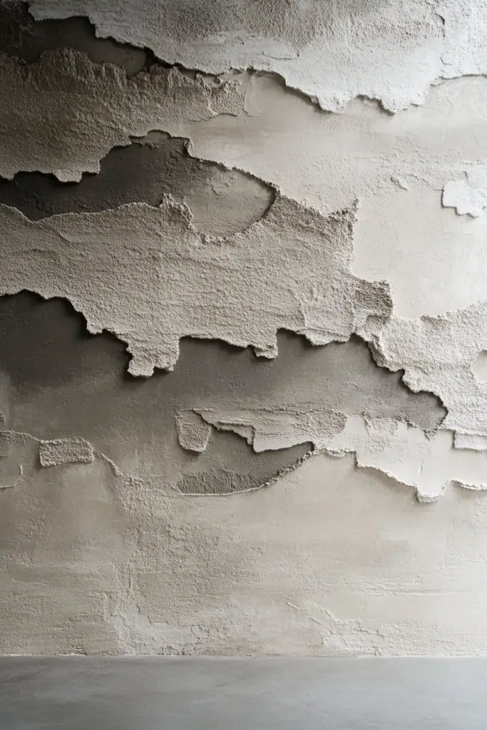
Does your wall feel flat and boring, lacking depth or visual interest? Layered paint techniques can add richness and complexity, giving your walls a museum-quality finish. It’s a way to create a textured, multi-dimensional surface that looks sophisticated and custom. Perfect for those who love a bit of artistic flair in their decor.
Imagine a wall where a base coat of soft gray is overlaid with subtle sponging or rag-rolling in darker shades. The layered effect creates shadows and highlights, making the surface appear textured and alive. The visual depth mimics natural materials like stone or aged plaster. When lit properly, the variations cast gentle shadows, adding warmth and character.
Use different tools—sponges, rag rollers, or brushes—to achieve various textures. Combine multiple colors within the same palette for a seamless layered look. This technique works well in both modern and traditional settings, adding richness without clutter. Seasonal updates might include changing the overlay colors or intensities.
Start with a smooth, dry surface and apply a base coat. Use a sponge or rag dipped in a darker or contrasting color, then lightly dab or roll over the base. Layer gradually, building up depth without overpowering the base color. For more texture, incorporate metallic or pearl paints within the layers. Finish with a matte or satin sealer to lock in the effect.
Add subtle metallic or iridescent accents within the layers for extra dimension. Personalize by choosing color combinations that match your decor or mood. Use stencils or templates for specific patterns within the layered surface. The goal is to create a rich, nuanced backdrop that feels both artistic and refined.
Layered paint techniques elevate your walls from simple surfaces to works of art. They offer endless variation and customization, making each room distinctive. Once you master the layering process, you’ll be inspired to explore other textured finishes. Ready to add depth and complexity?
15. Two Tone Wall with Minimalist Color Contrast for Calmness
Craving a serene, clutter-free environment? Minimalist color contrast creates a calm, balanced atmosphere that soothes the mind. It’s perfect for bedrooms, meditation spaces, or any area where tranquility is key. This approach strips away unnecessary fuss, focusing on simplicity and harmony.
Picture walls painted in soft, muted shades like blush and warm beige or cool gray and icy white. The subtle contrast provides visual interest without overwhelming the senses. The smooth transition between tones fosters a peaceful flow, making the space feel open and uncluttered. The overall effect is understated elegance that invites relaxation.
Choose colors within the same tonal family for a monochromatic effect or complementary muted shades for a bit of contrast. Keep the design simple—no sharp lines or bold patterns—just gentle transitions or flat color blocks. This style adapts well to small or large rooms, enhancing natural light and space perception. Seasonal updates might involve swapping out shades for slightly darker or lighter versions.
Paint the wall with your chosen tones, starting with the lighter shade as a base. Use painter’s tape if you want sharp blocks, or blend the colors softly for a gradient effect. Multiple thin coats ensure an even finish. For subtle transitions, feather the edges with a dry brush or sponge. Finish with a matte or eggshell topcoat to keep the look soft and matte.
Incorporate textured wall finishes or fabric-like paints for added depth. Keep accessories minimal—think streamlined furniture, soft textiles, and simple decor. Personalize with artwork or textiles that complement the subdued palette. The goal is to create a sanctuary that feels peaceful and refined.
Minimalist contrast offers a timeless, elegant aesthetic that’s easy to maintain and adapt. It’s ideal for creating a sanctuary that promotes calm and focus. Once you see how simple colors can transform a space, you’ll be motivated to embrace understated design. Ready for a peaceful retreat?
16. Two Tone Wall with Bold Top and Bottom Color Divisions
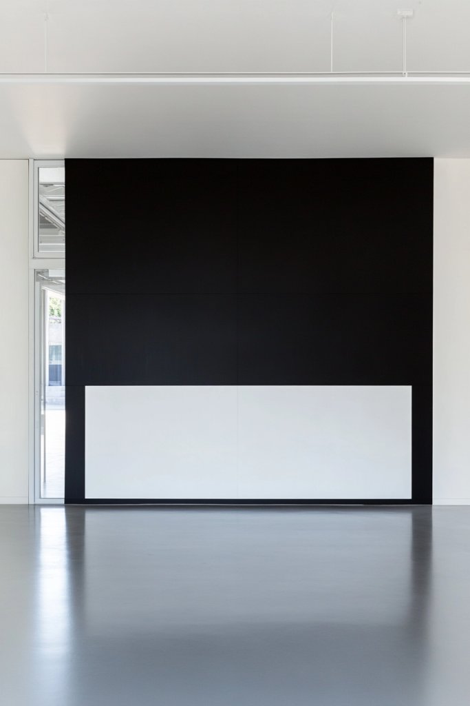
Want to add drama and structure to your room? Bold top and bottom color divisions create a striking, architectural look that commands attention. It’s a simple yet impactful way to define space and add visual weight. Perfect for creating a sophisticated or edgy vibe in any room.
Picture a wall painted with a deep navy on the top half and crisp white on the bottom, divided by a clean, straight line. The contrast emphasizes the room’s height and adds a sense of balance. This technique offers a bold statement that can be softened with textured finishes or sharp with high-gloss paint. It’s like framing your wall in a modern, artistic way.
Play with colors—try a black and gold combo for elegance or bright red and turquoise for boldness. The division line can be straight, curved, or zigzag for different effects. Use high-gloss or metallic paints for a luxe look, or matte for a more understated vibe. This technique works well with large furniture and minimal decor to let the wall shine. Seasonal updates include changing the color contrast or adding decorative borders.
Mark the division line with a level and pencil, then tape it carefully. Paint the top and bottom sections with your chosen colors, applying multiple coats if necessary. Remove the tape once the paint dries for crisp, sharp edges. If you want a more textured effect, consider using textured or metallic paints. For a seamless finish, lightly sand rough areas and touch up with a fine brush.
Add metallic or textured accents along the division line for extra flair. Incorporate decorative molding or a border to frame the color block. Personalize by choosing colors that reflect your personality or match your decor palette. You could also add a pattern or motif within the colored sections for further interest.
Bold top and bottom divisions create a commanding focal point that elevates your entire decor. They’re easy to customize and can be as dramatic or subtle as you like. Once you see how they transform the room, you’ll be inspired to experiment with other architectural details. Ready to add structure and style?
17. Two Tone Wall with Creative Tape Patterns for Unique Styles
Looking for a way to make your walls truly one-of-a-kind? Creative tape patterns let you design personalized, artsy walls with minimal effort. Whether it’s stripes, chevrons, or abstract shapes, this method offers endless possibilities for self-expression. It’s perfect for adding a playful or avant-garde touch to your space.
Visualize a wall covered with bold, diagonal stripes in contrasting colors like black and yellow or pastel pink and mint. Or imagine abstract, irregular shapes arranged in a pattern that’s uniquely yours. The tape creates crisp, clean edges that define each shape, giving a graphic, modern look. The contrast and patterns add energy and personality, turning your wall into a conversation piece.
Use painter’s tape to create patterns like chevrons, zigzags, or geometric shapes. Mix and match colors to match your mood or decor theme. For a softer look, choose pastel shades; for more impact, go for high-contrast combinations. Combine multiple patterns or overlay shapes for a layered, dynamic effect. Seasonal updates can involve changing the colors or adding new shapes.
Sketch your pattern on paper first for precision. Tape out your design carefully, pressing down edges firmly. Fill in the shapes with contrasting paints, applying multiple coats if needed for vibrancy. Remove the tape slowly once paint is dry to reveal sharp lines. For complex designs, use a level or grid to maintain symmetry. Finish with a protective clear coat or matte sealant.
Add metallic or glitter tape within some shapes for extra sparkle. Incorporate personal symbols or initials into the design. Use textured paints or layered colors to add depth. Personal touches like small LED lights or 3D elements can further make your wall stand out. The goal is to create a custom, artsy masterpiece.
Creating tape patterns is a playful, creative way to customize your walls. It encourages experimentation and personal flair, making your space truly yours. Seeing a wall transformed into a geometric or abstract art piece boosts confidence in DIY decor. Ready to tape your way to a unique wall?
Conclusion
Exploring these diverse two tone wall ideas opens up a world of design possibilities to personalize your space. Whether you choose striking contrasts or harmonious hues, these ideas are easy to implement and sure to make a lasting impact. Don’t be afraid to experiment and let your creativity shine—your dream wall is just a paintbrush away!